Abin's Portfolio

JBS
Unified political engagement through a mobile-first platform.
Mobile Application
Information Architecture
Prototype Design
Team
1 Designer · 1 Developer · 1 Stakeholder
Duration
Concept Product
Platform
Mobile Application
Disciplines

UX, UI, IA, Prototype

Jump to Design >>
Overview
What is JBS?
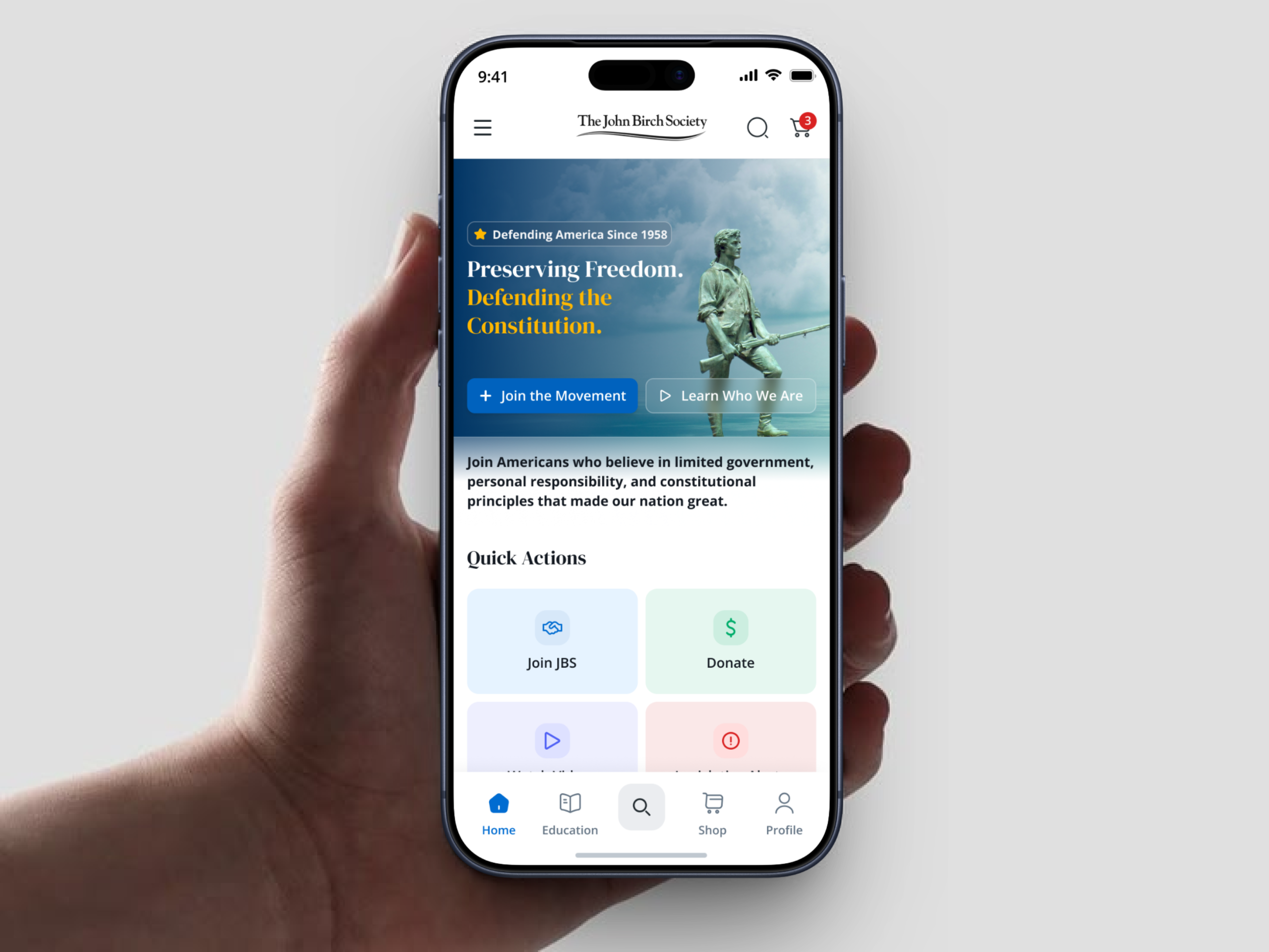
JBS is a political engagement mobile application designed to centralize multiple user interactions into one structured platform. The app brings together political information, public participation, memberships, donations, books, merchandise, news, and blog content within a single digital experience — replacing fragmented digital touchpoints where users previously had to navigate separate sources.
Goals
What we set out to do
01
Create a clear mobile experience that makes political information easy to access and understand.
02
Combine membership, donations, and purchases into one unified system.
03
Reduce friction between reading content and completing meaningful actions.
Pinpoint + Challenge
The core problem
The core opportunity was identifying how multiple independent functions could exist inside one mobile platform without making the experience feel overloaded. The product needed to support both informational and transactional behavior while preserving clarity and trust.
01
Large volumes of political content required strong hierarchy to prevent reading fatigue.
02
Membership, donation, and store features introduced multiple action paths that could easily compete for user attention.
03
The platform needed to balance authority, readability, and usability without feeling visually dense.
Product Thinking
Three user intentions
Understanding
Create a clear mobile experience that makes political information easy to access and understand.
Participating
Membership enrollment through a guided digital flow built for first-time and returning members.
Supporting
Dedicated contribution and store experience that supports direct financial participation.
App Screens
Interface design
App Screens
App screen

Explore the full flow.

Key Design Decisions
What shaped the experience
Information before action
Mission, vision, and official updates appear before donation and membership prompts. Users receive context before being asked to commit.
Modular feature structure
Books, merchandise, and blog content were separated into scalable card-based sections to prevent cognitive overload.
Simplified navigation
Primary actions remain visible via persistent bottom navigation without interrupting reading flow or feature discovery.
Core Features
What the platform does
Membership
Users join through a guided digital flow supporting both new and recurring members.
Donation
A dedicated contribution experience supports direct financial participation at any level.
Books & Merchandise
Users explore and purchase products connected to the organization in a card layout.
News & Blog
Political updates are organized in a filterable, readable content system with category tags.
Outcome
What was delivered
The final product creates a mobile ecosystem where information, participation, and contribution work together inside one structured interface. The experience supports both first-time exploration and repeated engagement — reducing the need to navigate across fragmented digital touchpoints.
Learnings
What this taught us
01
Designing political products requires strong trust through visual hierarchy.
02
When multiple features exist, navigation must feel intentional rather than feature-heavy.
03
Content-driven products need spacing and structure more than visual complexity.