Supporters had to jump between separate sources to read updates, join, donate or buy a book. JBS brings political information, public participation, memberships, donations, books, merchandise, news and blog content into one structured mobile experience.
The problem
Many independent functions, spread across fragmented touchpoints, with no single place to understand and act.
The team
One designer, one developer and one stakeholder. I owned UX, UI, information architecture and the prototype.
The result
A mobile app where reading, joining, giving and shopping live together without feeling crowded.
What had to fit in one app
Political information
Public participation
Membership
Donations
Books
Merchandise
News
Blog
01 · Who it's for
Three reasons to open the app.
Some people come to understand, some to take part, and some to support. Often it's the same person on different days, so the app had to serve all three without making anyone dig.
Understanding
Political information that's easy to access and actually understand.
Participating
A guided membership flow for first-time and returning members.
Supporting
Donations and a store for direct financial participation.
02 · The real problem
Every feature wanted to be first. None of them could be.
The opportunity wasn't adding features. It was letting many independent functions live in one app without it feeling overloaded, while keeping both reading and paying clear and trustworthy.
Goal 01
A clear mobile experience that makes political information easy to access and understand.
Goal 02
Membership, donations and purchases combined into one unified system.
Goal 03
Less friction between reading content and completing a meaningful action.
So the brief wrote itself
How might we fit reading, joining, giving and shopping into one app, without it feeling crowded or pushy?
03 · The challenges
Three challenges, pinned down.
Each one shaped a key decision. Tap a card to see what it meant for the design.
04 · Key decisions
Context first, then the ask.
Three decisions did most of the work.
01
Information before action
Mission, vision and official updates appear before donation and membership prompts. People get context before they're asked to commit.
02
Modular feature structure
Books, merchandise and blog content sit in scalable card-based sections, so no single area overloads the screen.
03
Simplified navigation
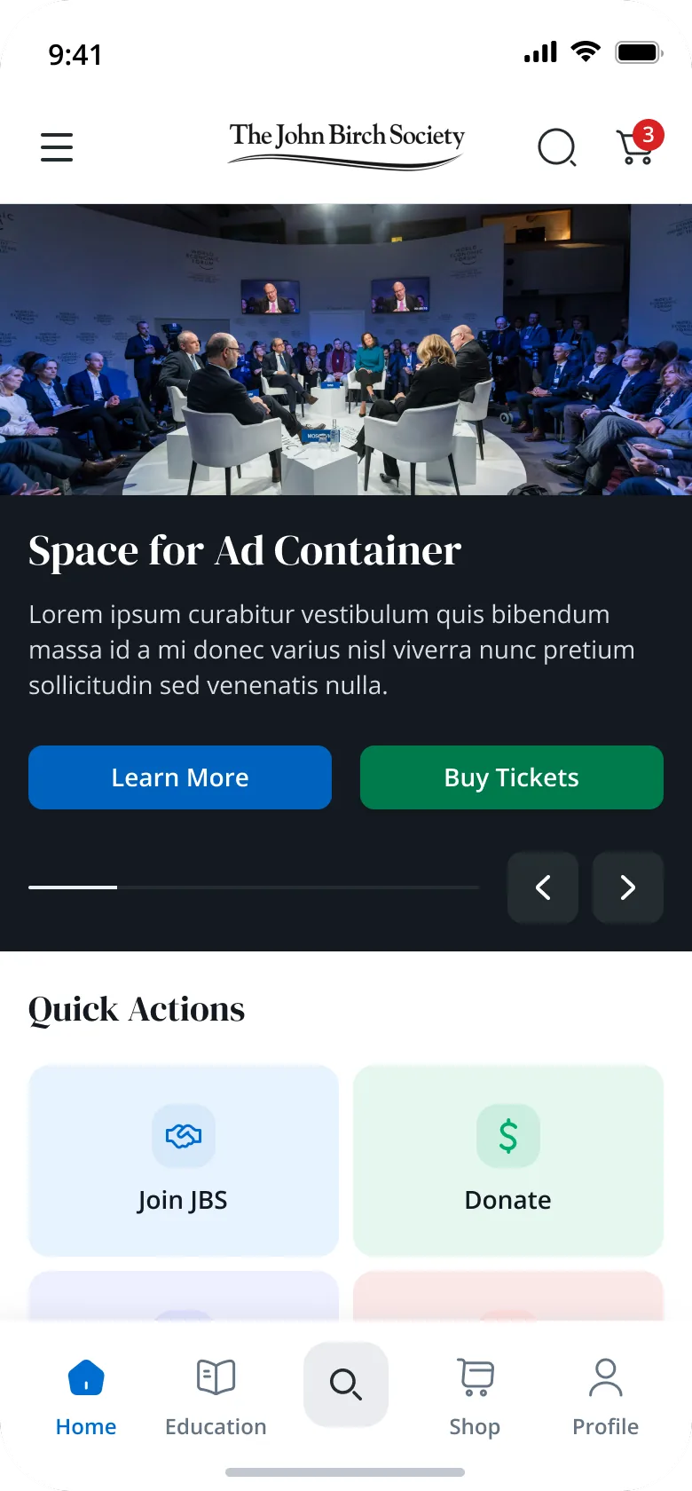
A persistent bottom bar keeps primary actions in reach without interrupting reading or discovery.
05 · The final UI
Here's where it landed.
Pick a flow and scroll through the screens, or click through the live prototype below.
Launch
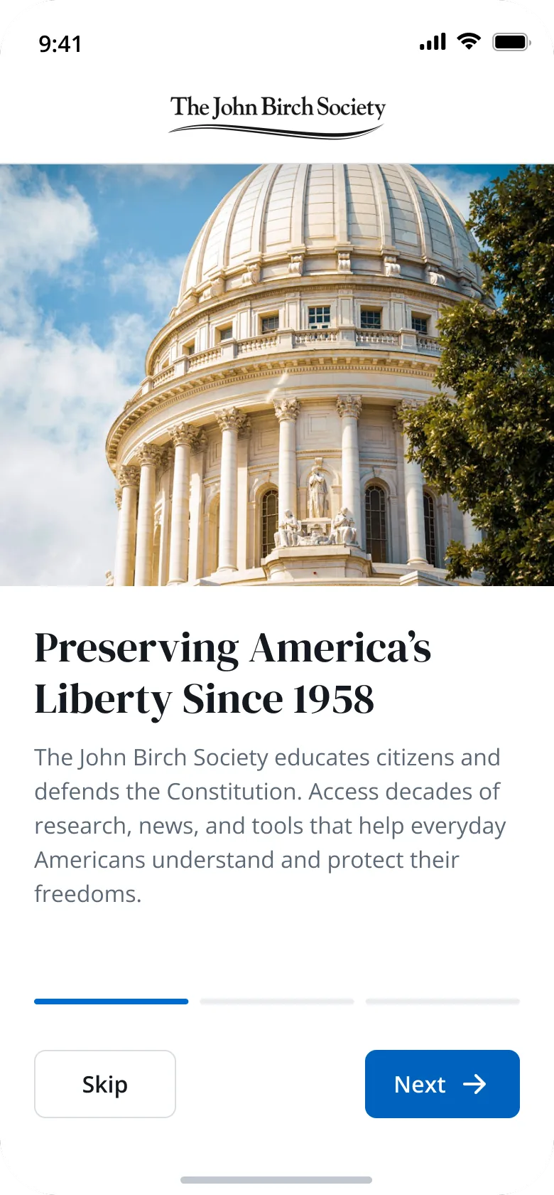
Onboarding — Preserving liberty
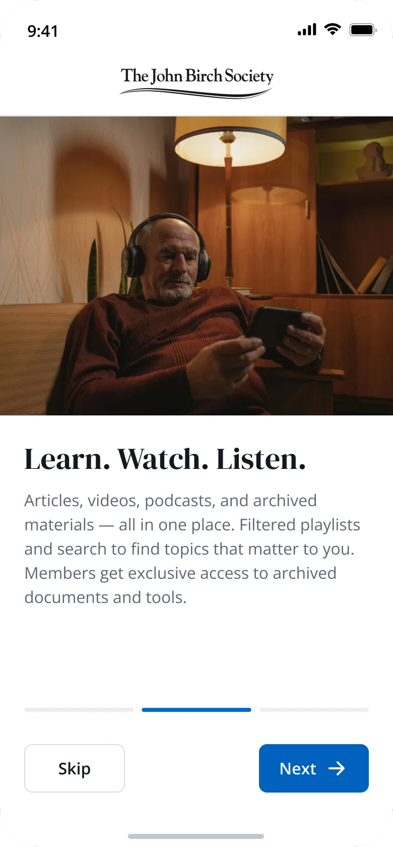
Onboarding — Learn, watch, listen
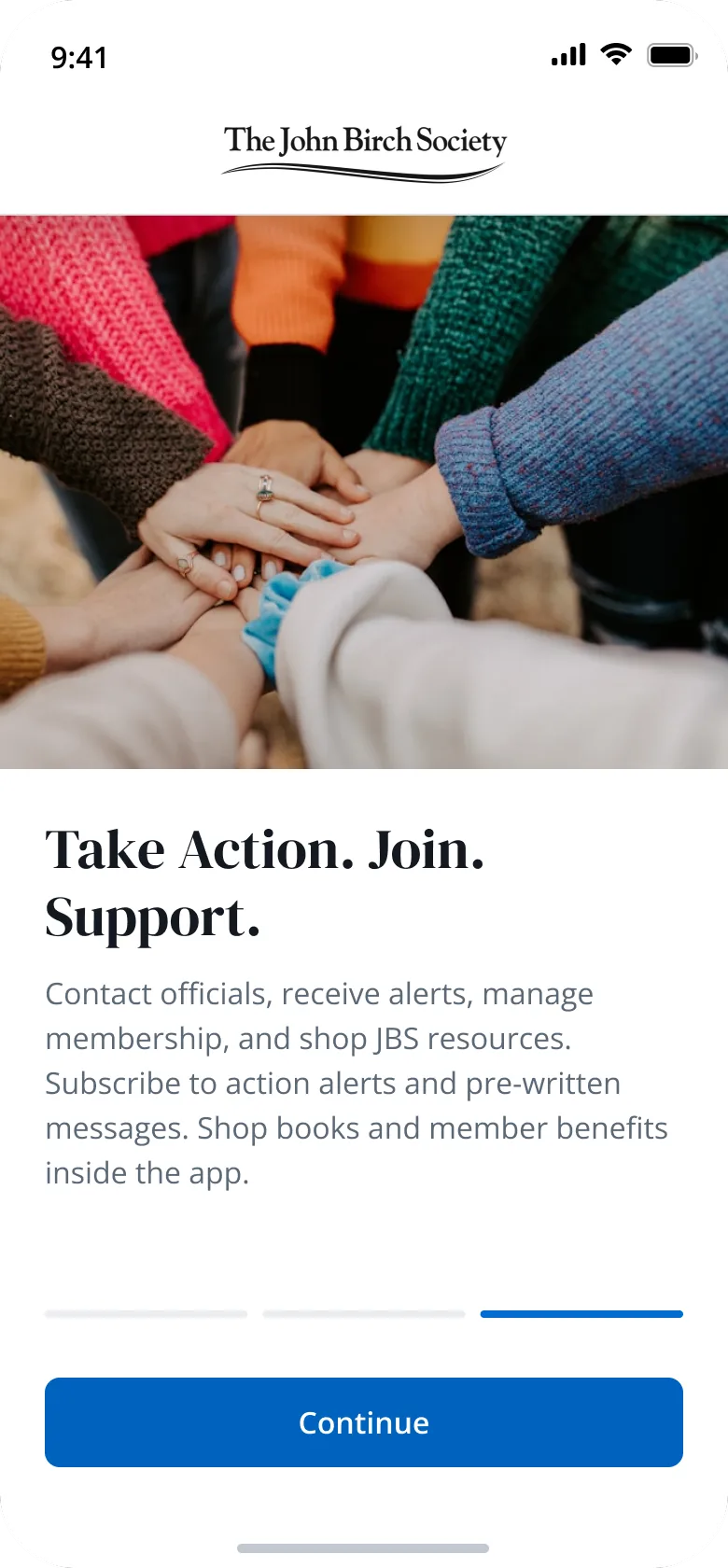
Onboarding — Take action
Home
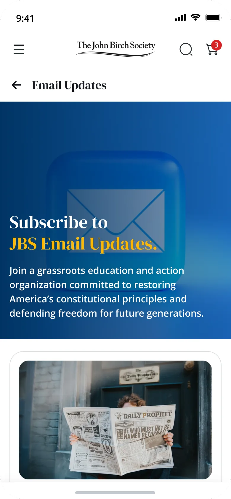
Email updates
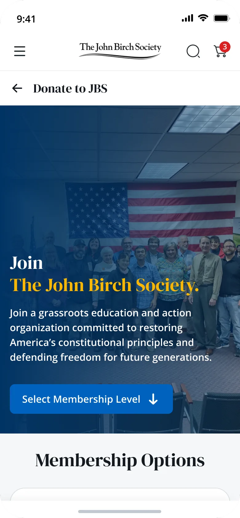
Membership
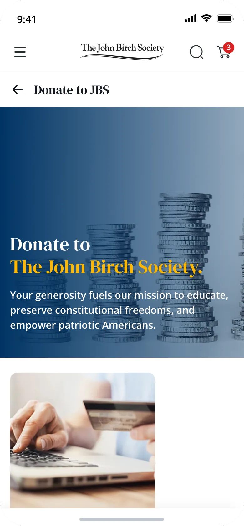
Donate
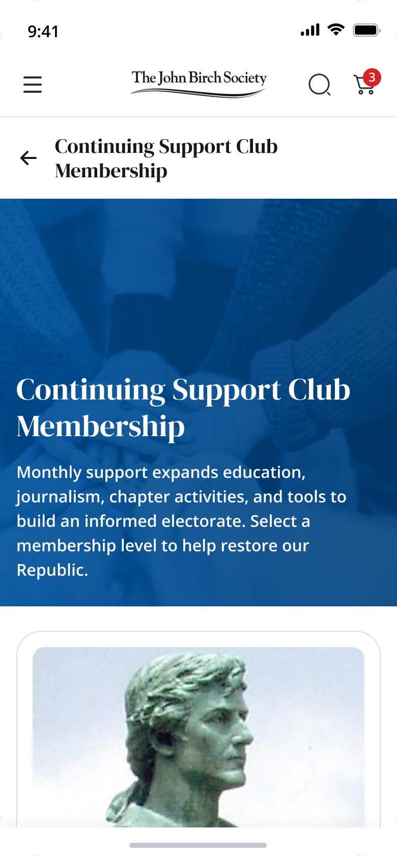
Continuing Support Club
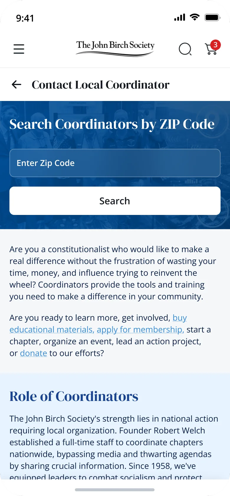
Local coordinator
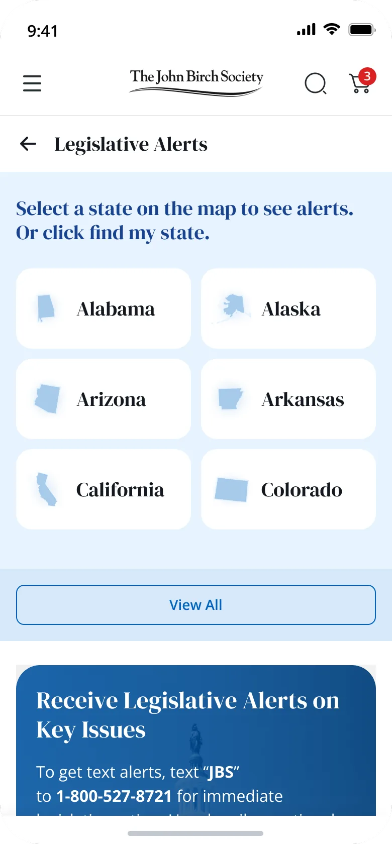
Alerts by state
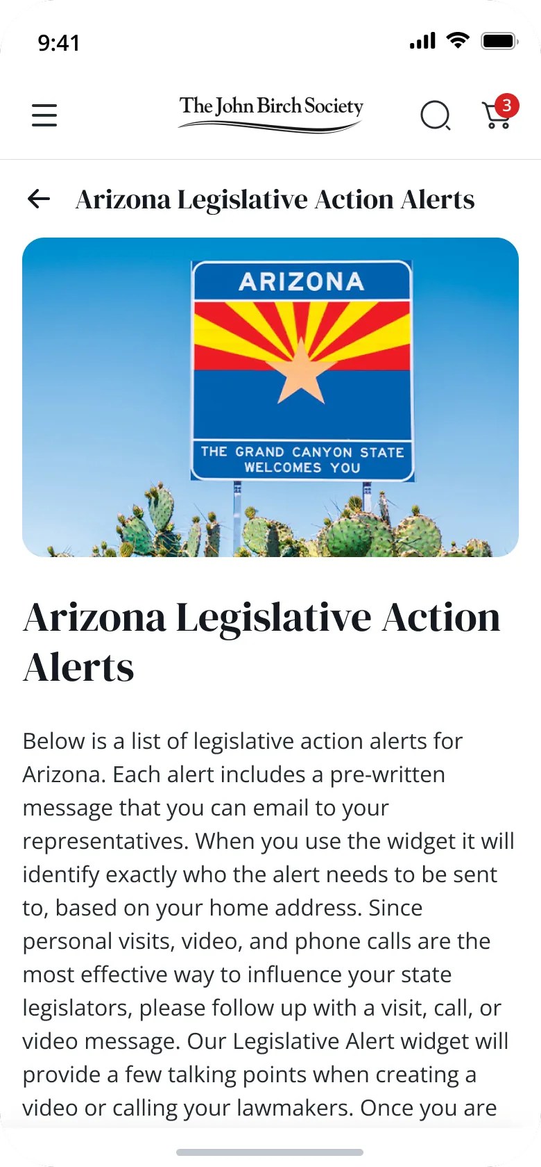
State alerts
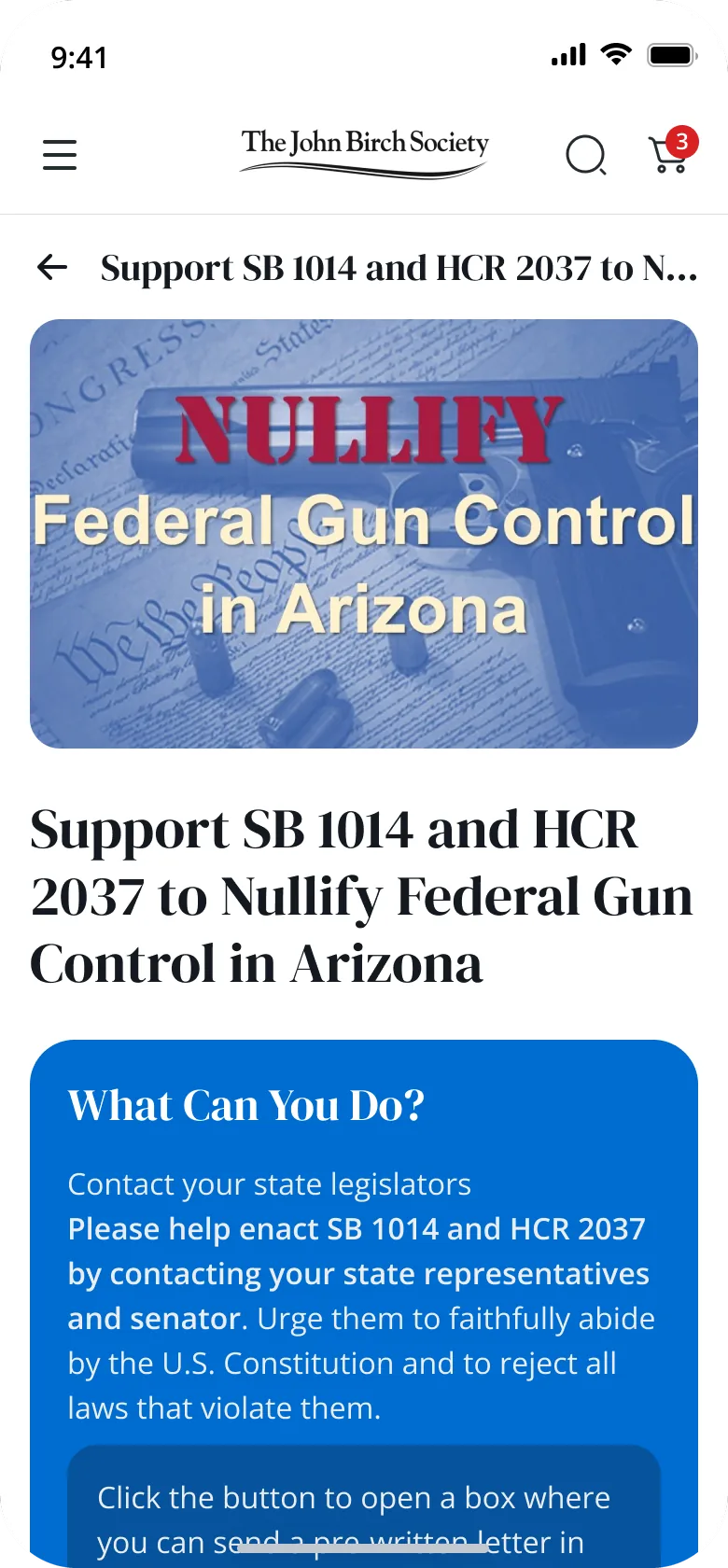
Alert detail
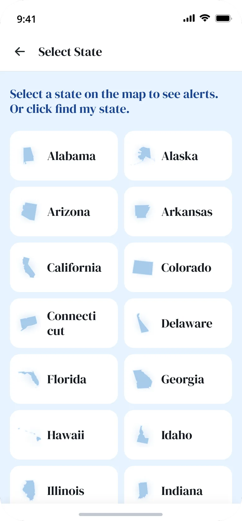
Select state
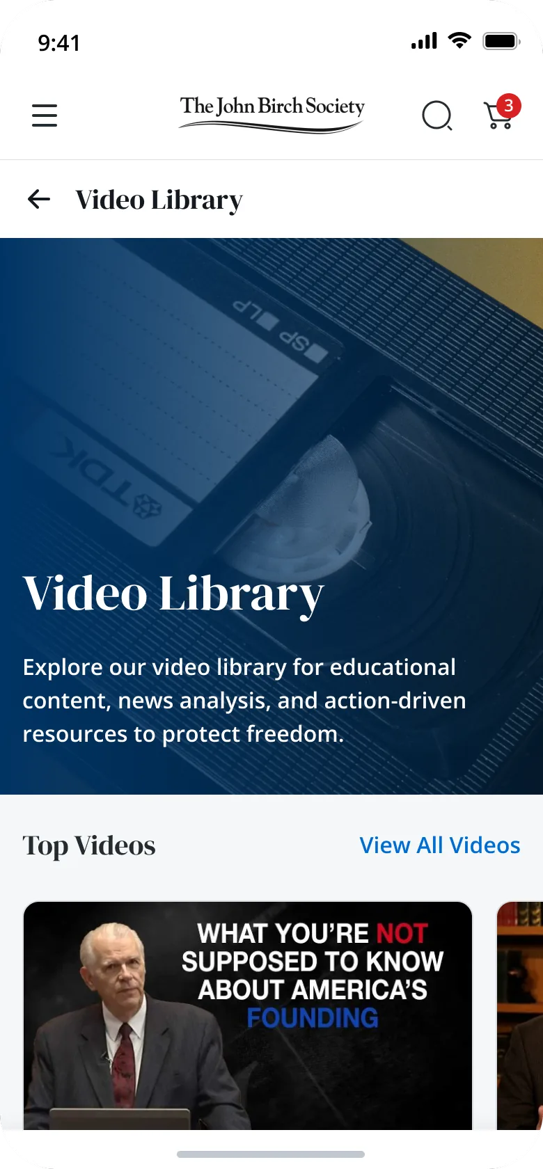
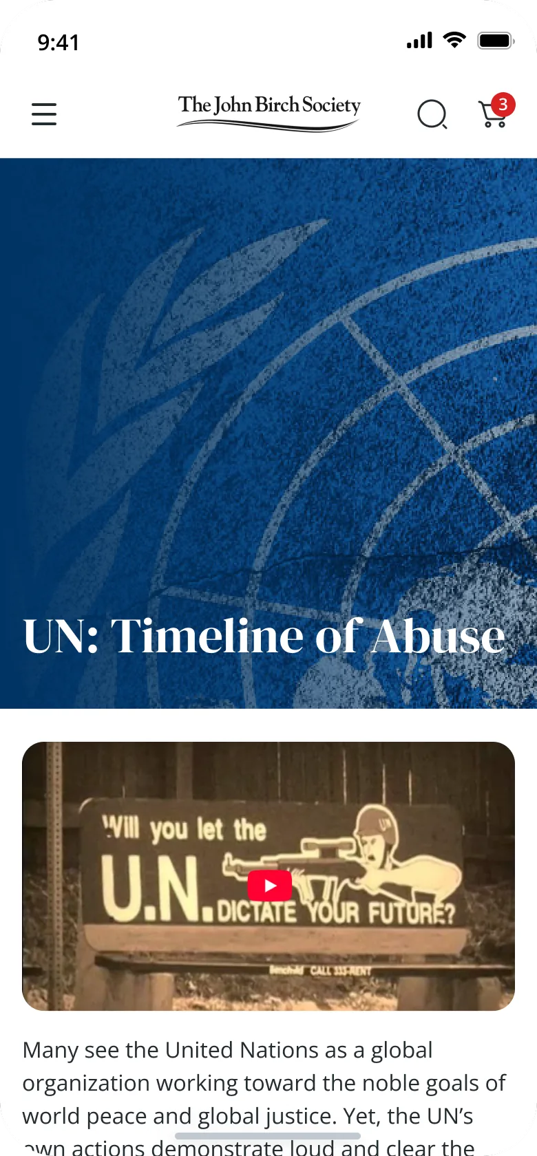
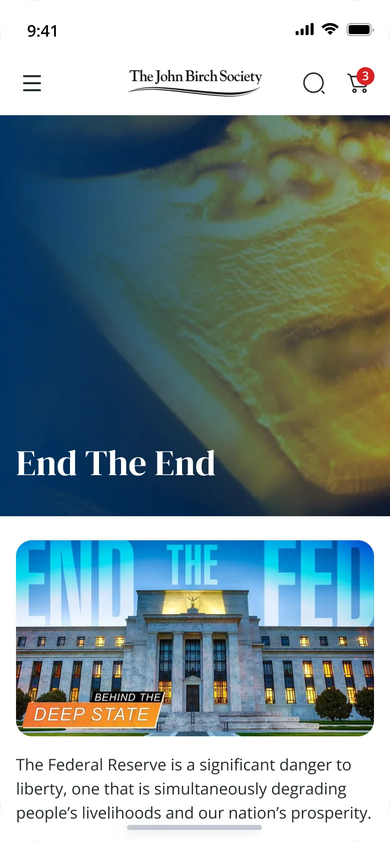
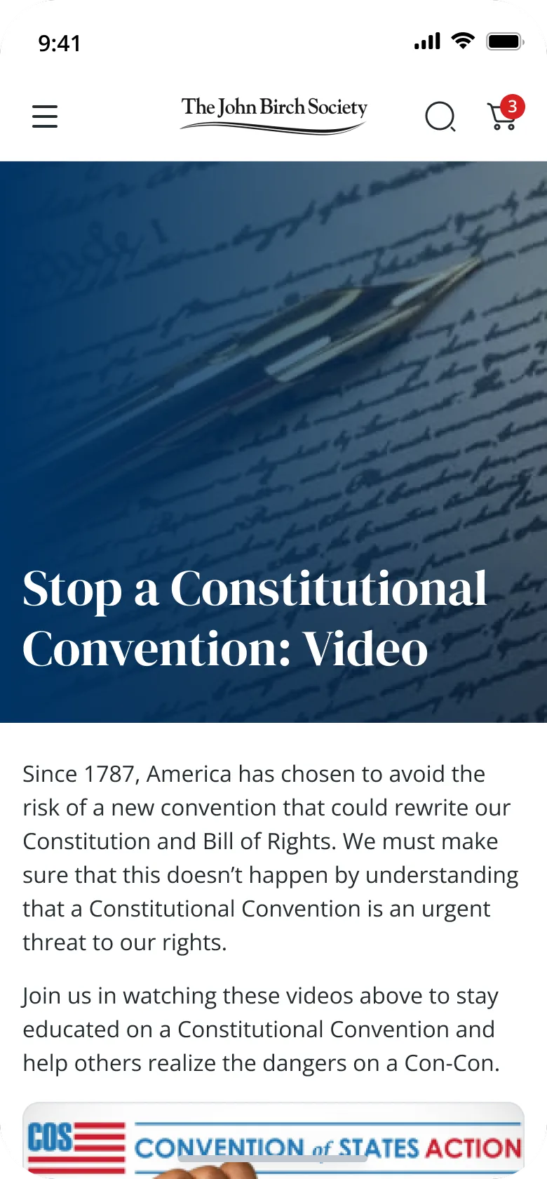
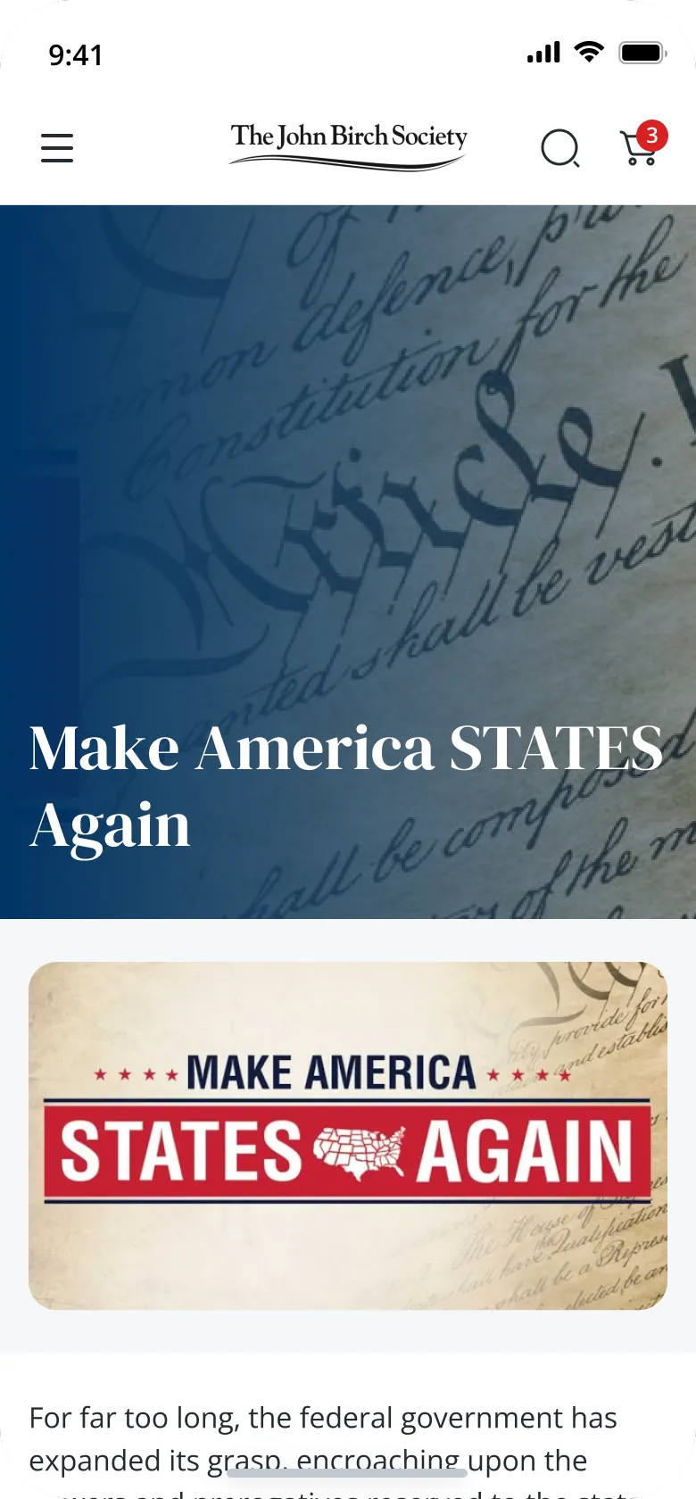
Video library
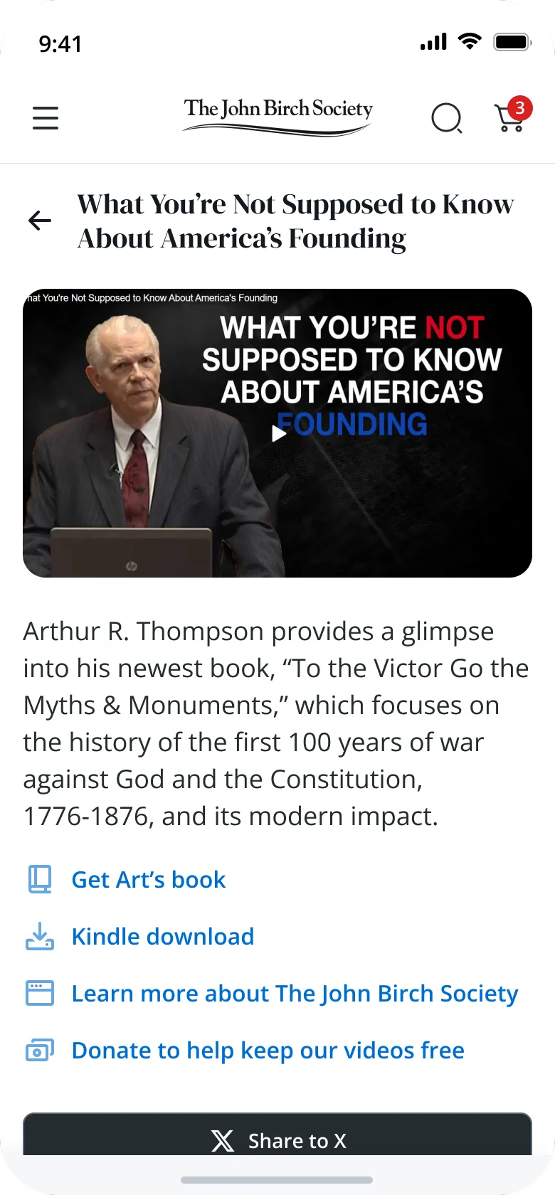
Video detail
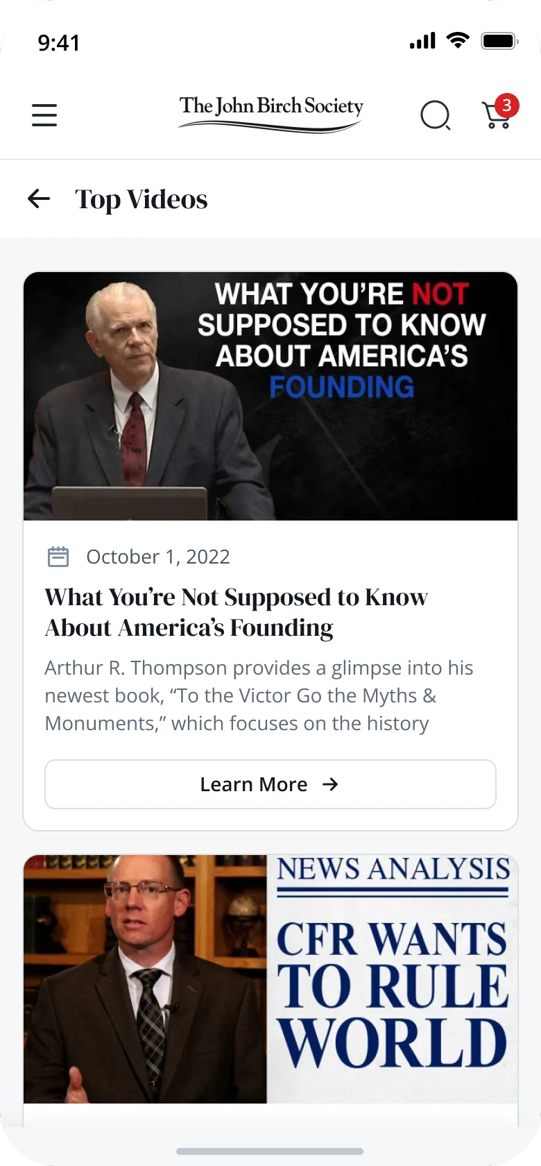
Top videos
UN: Timeline of Abuse
End the Fed
Stop a Con-Con
Make America States Again
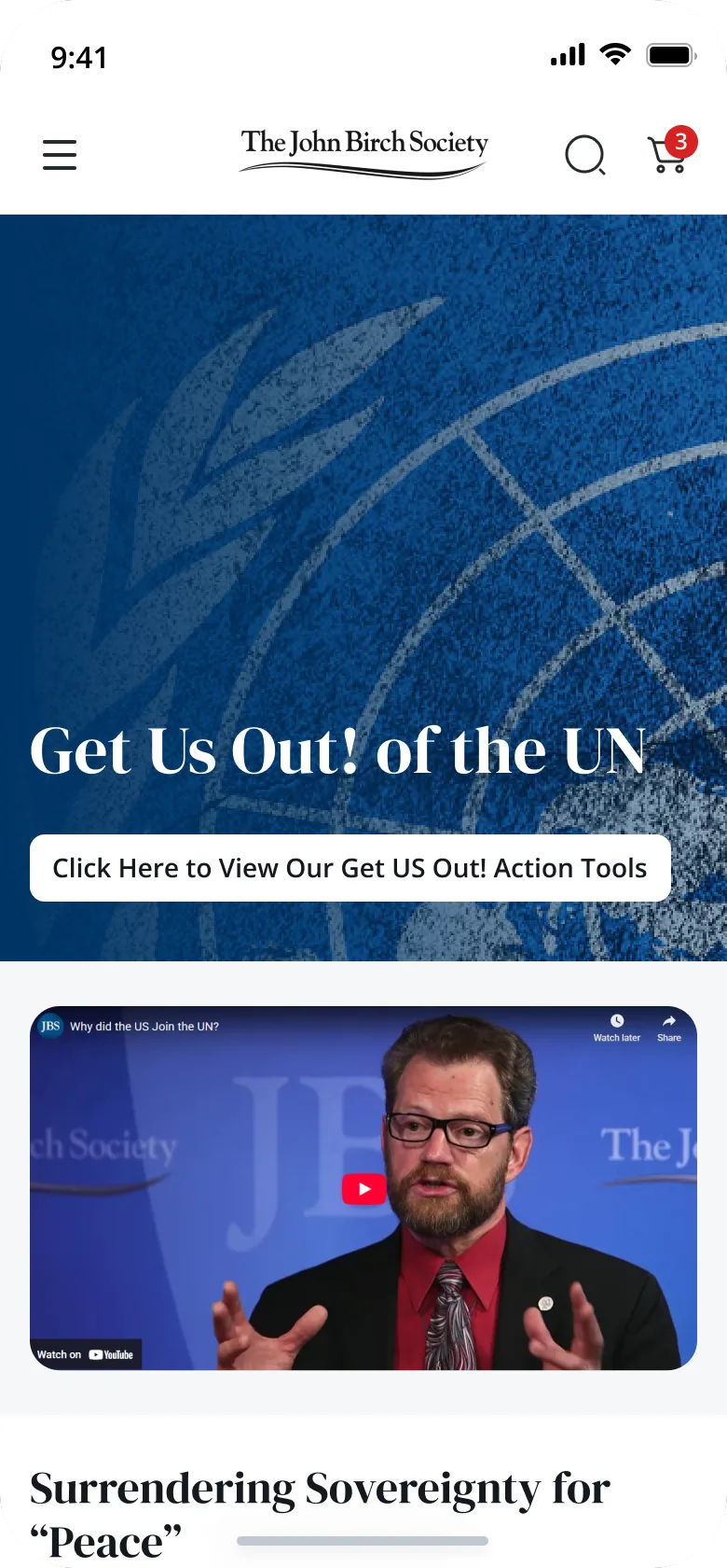
Get US Out! of the UN
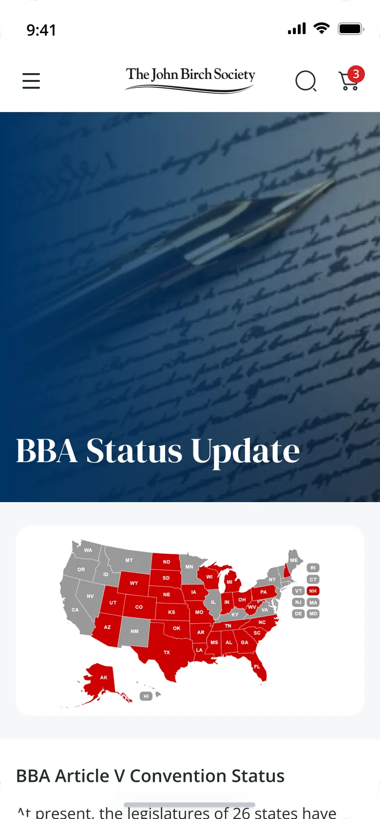
BBA status update
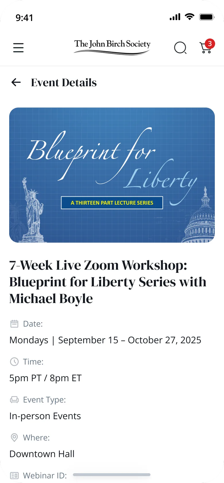
Event details
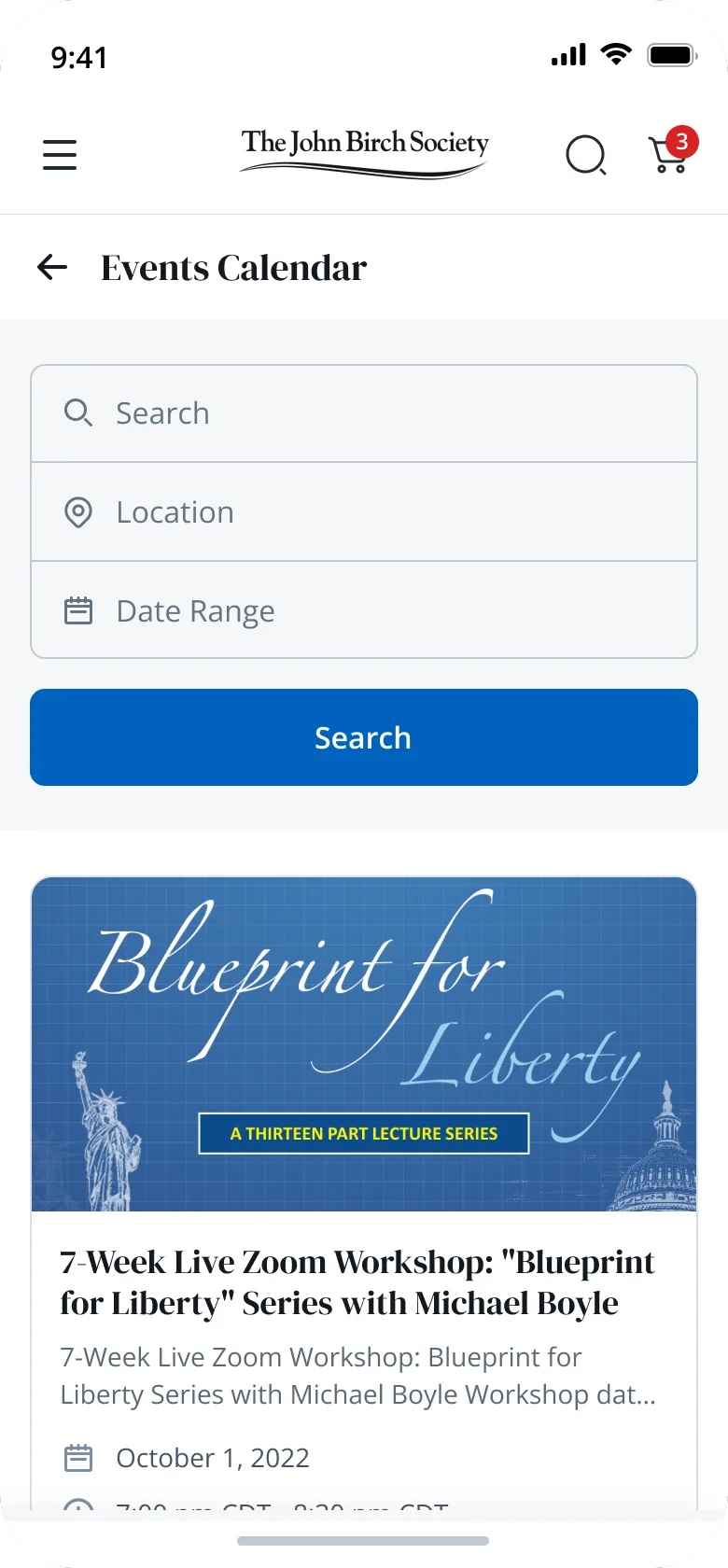
Events calendar
Explore the full flow.Interactive prototype — click through it right here.
06 · What it does
Four jobs, one bottom bar.
Membership
A guided digital flow for both new and recurring members.
Donation
A dedicated contribution experience for support at any level.
Books & merchandise
Products connected to the organization, browsed and bought in a card layout.
News & blog
Political updates in a filterable, readable content system with category tags.
The takeaway
I started with a product that wanted to do everything at once. I wanted one that lets people read first, then act.
Information before action built trust before asking for commitment.
Modular cards stopped books, merch and blog from crowding each other.
A persistent bottom bar kept the important actions close, without interrupting.
Political products earn trust through visual hierarchy. When many features exist, navigation has to feel intentional rather than feature-heavy, and content-driven products need spacing and structure more than visual complexity.